Tele2 believes in unleashing the unlimited opportunities that connectivity provides to all our customers. Tele2 fast networks enable mobile and fixed connectivity, telephony, data network services, TV, streaming and global IoT solutions for millions of customers.
Unlimited plans and reasonable prices!

01
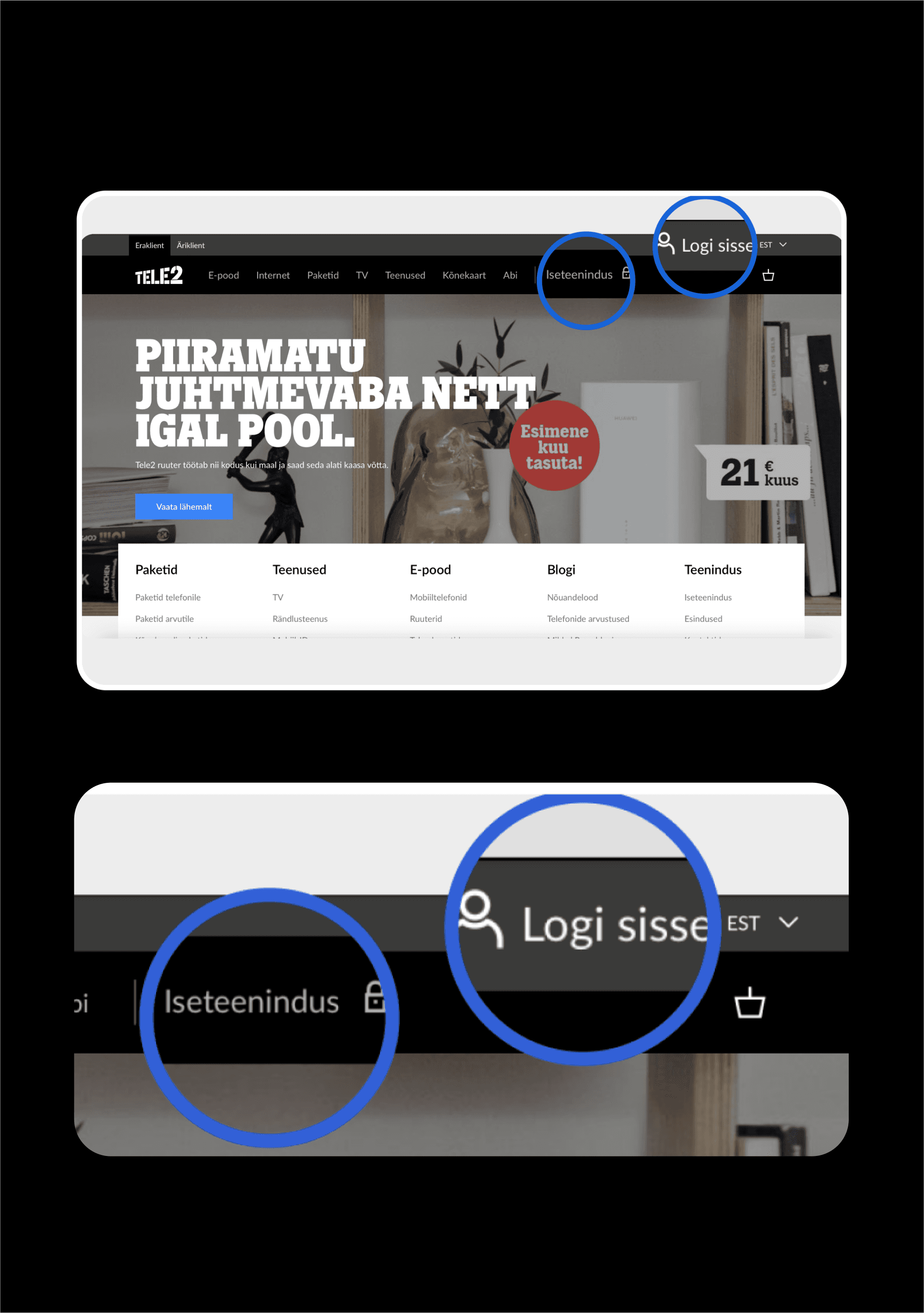
Tele2 faced a significant user experience challenge with their self-service platform, particularly during the sign-in process. The platform featured two distinct login buttons: one for the telecom self-service where customers could manage their accounts, and another for the SIM card self-service, which was used primarily for prepaid SIM card management. Users, especially new ones, found it confusing to determine which login button to use. During the user tests this confusion led to a substantial drop in self-service usage, with only 40% of existing Tele2 clients and 80% of potential clients managing to successfully log in/find to the appropriate service. In contrast, competitors had a self-service usage rate of up to 60%.
It is important to note that the sign-in process was just one part of a larger self-service research project aimed at increasing overall user engagement and self-service usage. Our comprehensive research revealed that Tele2's self-service usage percentage among active users was quite low. Improving the sign-in experience was identified as the first crucial step in addressing this issue and enhancing the overall self-service platform.
02
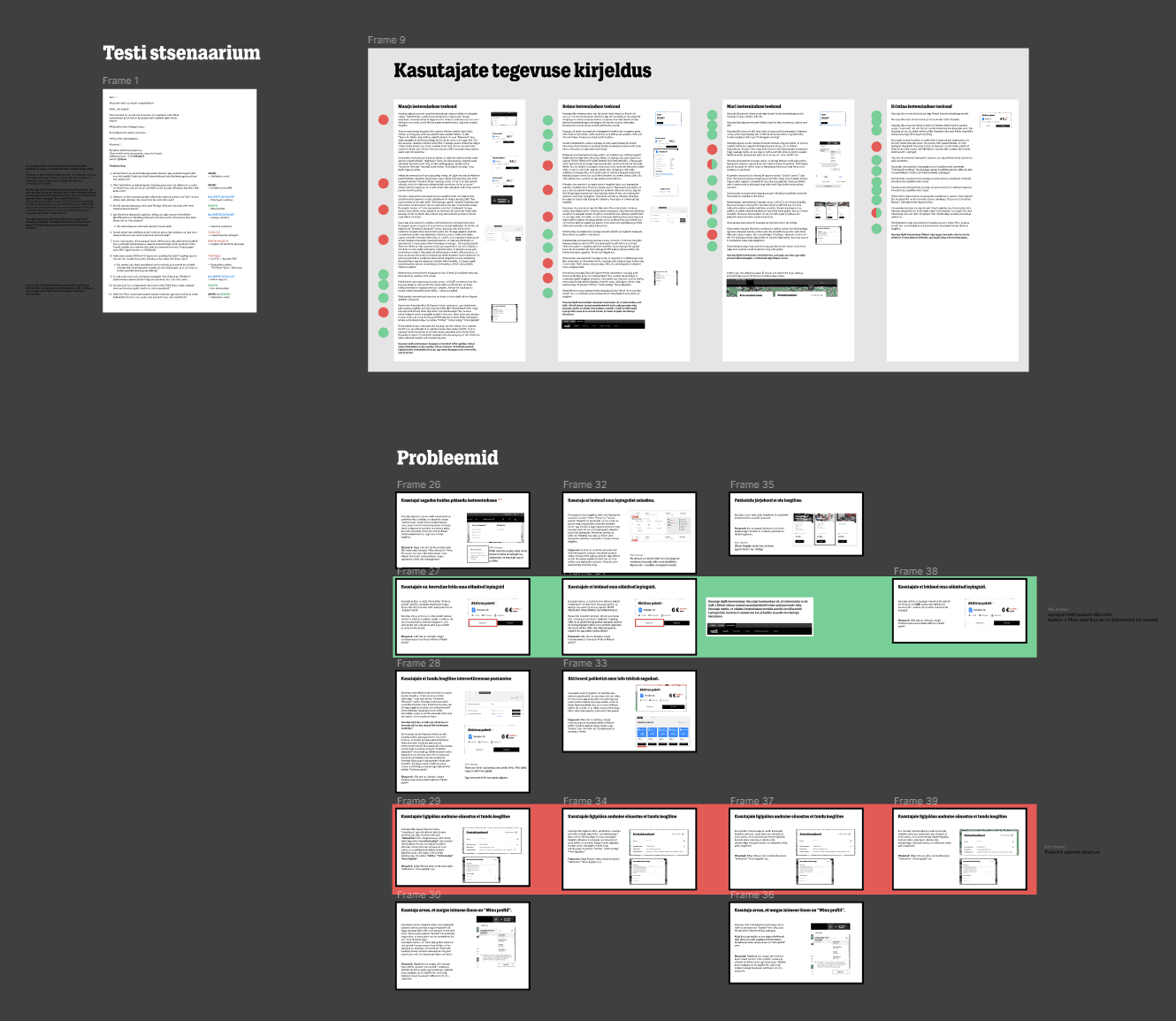
To address this issue, we conducted comprehensive UX research, including 30 (15+15) interviews and tests with both current Tele2 users and potential new users. The insights gathered from this research highlighted the need for a more intuitive sign-in process.
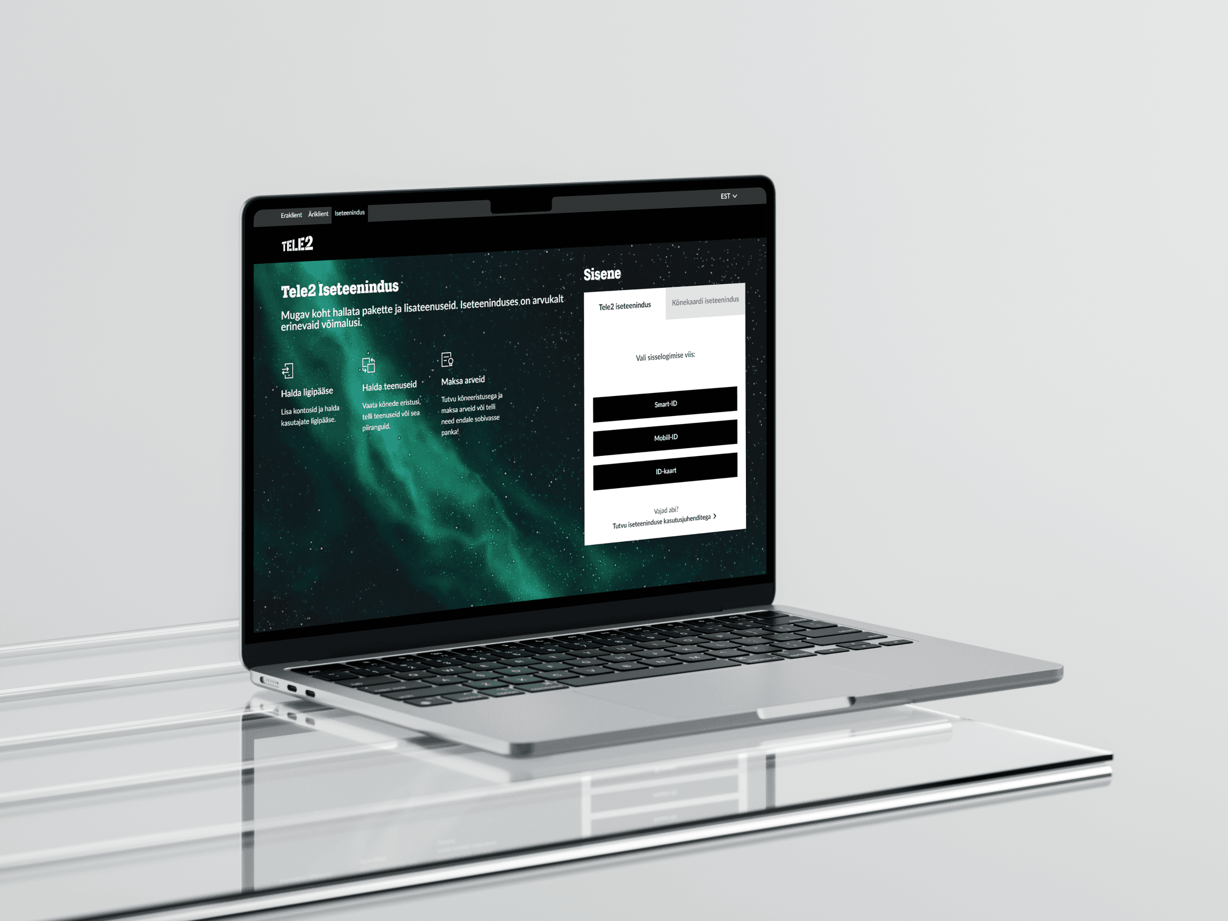
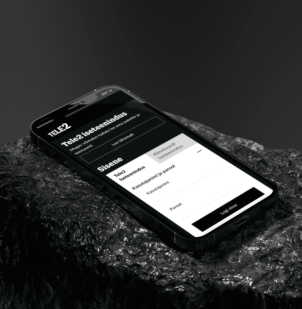
I proposed three wireframed solutions and tested them with an additional group of 15 potential users. The most effective solution was to consolidate the login buttons into a single entry point with two tabs above the login inputs: "Tele2 Self-Service" and "SIM Card Self-Service". This design allowed users to switch between the two services easily. By default, users would land on the "Tele2 Self-Service" tab, given its higher importance and usage.
03
In comparison to its competitors, Tele2's self-service adoption was significantly lower. Competitors achieved a self-service usage rate of up to 60% by providing a seamless and straightforward sign-in process. Tele2's dual-login approach created friction and confusion, deterring users from fully engaging with the self-service options.


04
The implementation of the new sign-in design led to an improvement in user engagement with the self-service platform. While specific numbers are confidential, this small yet impactful change contributed to an increase in self-service usage. This adjustment was part of a broader UX project aimed at enhancing the overall self-service experience.


05
My role in this case was from start to finish. I was involved in creating user-testing scenarios, conducting user interviews and usability tests, analyzing the data collected, and wireframing potential solutions as well as the final design. I collaborated with the Tele2 design and development teams to implement the chosen solution and monitored its impact on user engagement.
06